The food industry’s most successful brands share one universal truth — you eat with your eyes first.
Before a meal is ordered or a coffee is brewed, the logo has already shaped how we feel about the brand: familiar, indulgent, comforting, or even rebellious.
Restaurant and meal company logos sit at the intersection of psychology, nostalgia, and global recognition — they’re designed to make you hungry and loyal at the same time.
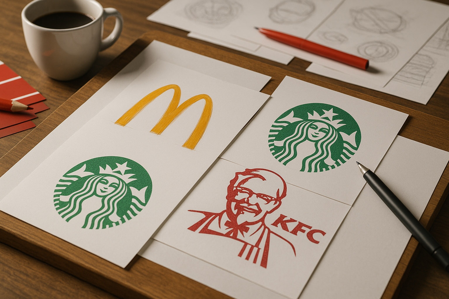
Below is a curated list of 15 of the most iconic meal and restaurant logos, chosen based on expert reviews, historical impact, and presence in design literature.
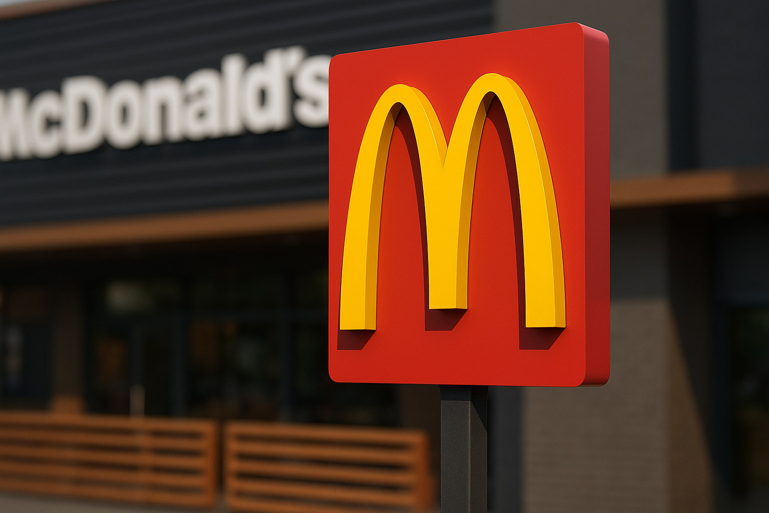
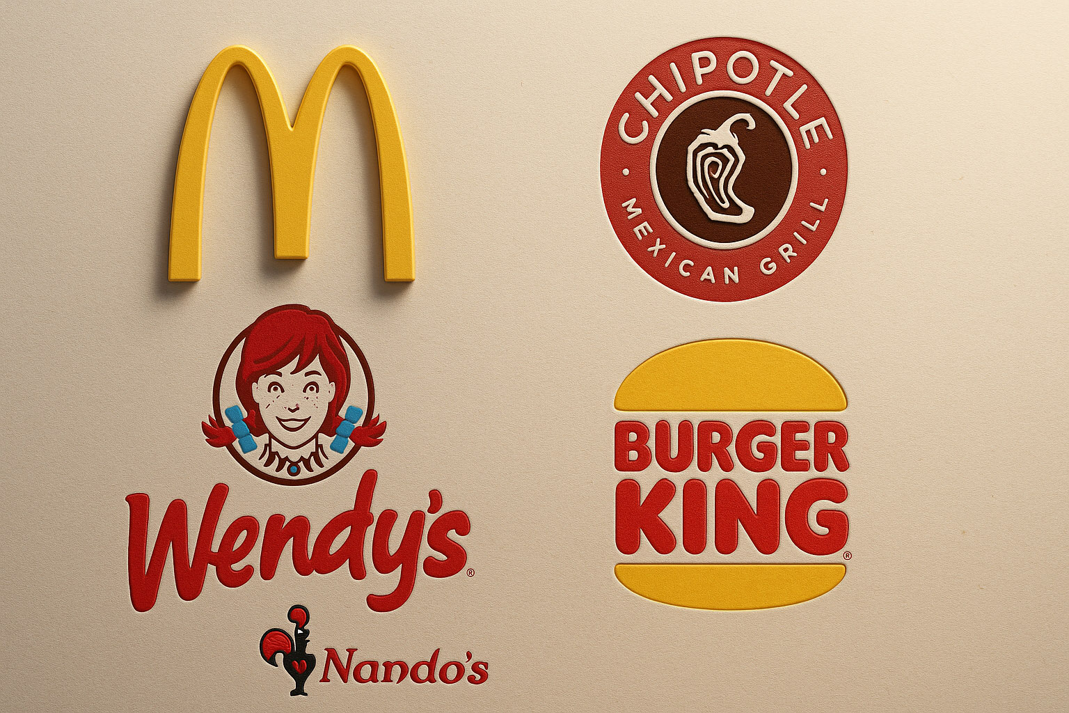
McDonald’s – The Golden Arches
- Designed by: Jim Schindler, 1962 (based on architecture by Stanley Meston)
- Cost: Roughly $1,000 for the original design
- Style: Modernist simplicity, warm colors, geometric symbolism
- In use since: 1962 (refined in 2003, 2018)
- Unknown fact: The arches were originally literal building supports, stylized later into a logo.
The yellow arches form one of the world’s most recognizable silhouettes — symbolizing optimism and global consistency.
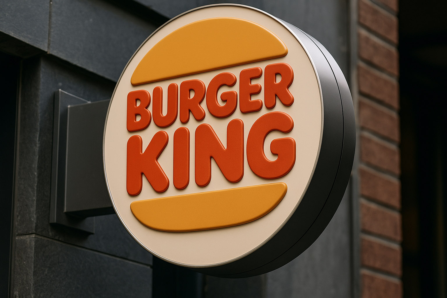
Burger King
- Designed by: Sterling Brands & Turner Duckworth (2000, 2021 refresh)
- Cost: Estimated $1 million (2021 overhaul)
- Style: Rounded typography, “buns and patty” composition
- Unknown fact: The new retro-inspired logo connects emotionally with customers by reviving 1970s design codes — warmth, simplicity, authenticity.
The 2021 rebrand embraced a nostalgic aesthetic consistent with the “real food” brand direction.
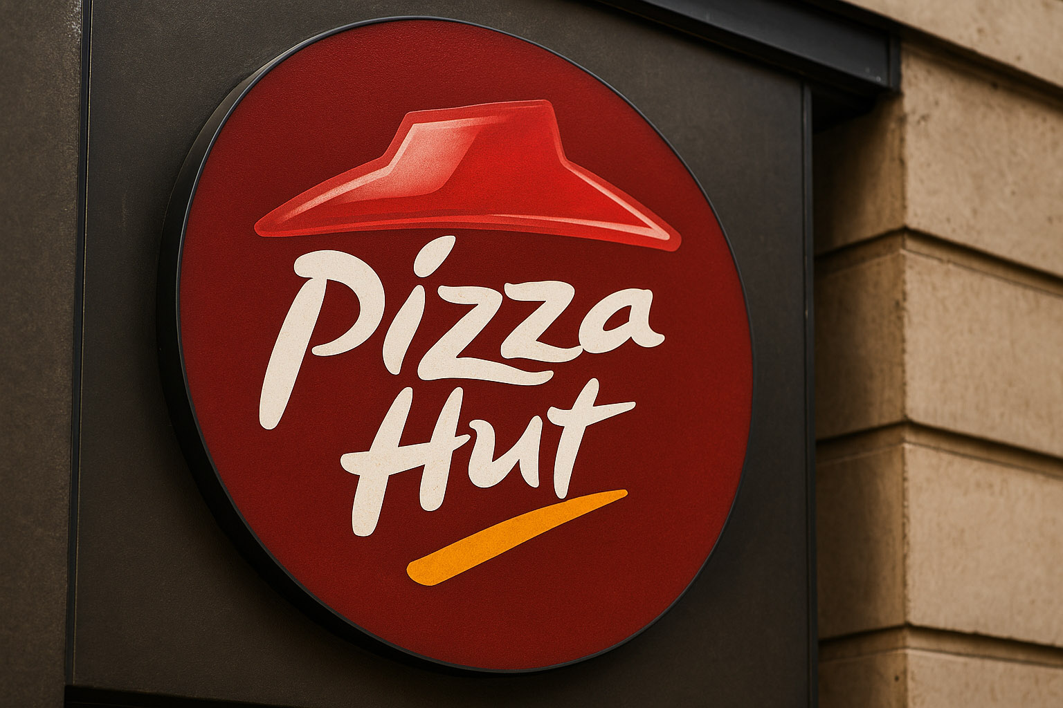
Pizza Hut
- Designed by: Donald Shepard (1969 logo); Jones Knowles Ritchie (2019 refresh)
- Cost: $2.5 million (full rebrand rollout)
- Style: Hand-drawn, brushstroke typography with a roof silhouette
- Unknown fact: The red roof motif was first used in restaurant architecture, then became the brand mark itself.
Its friendly red tone was selected to subconsciously stimulate appetite.
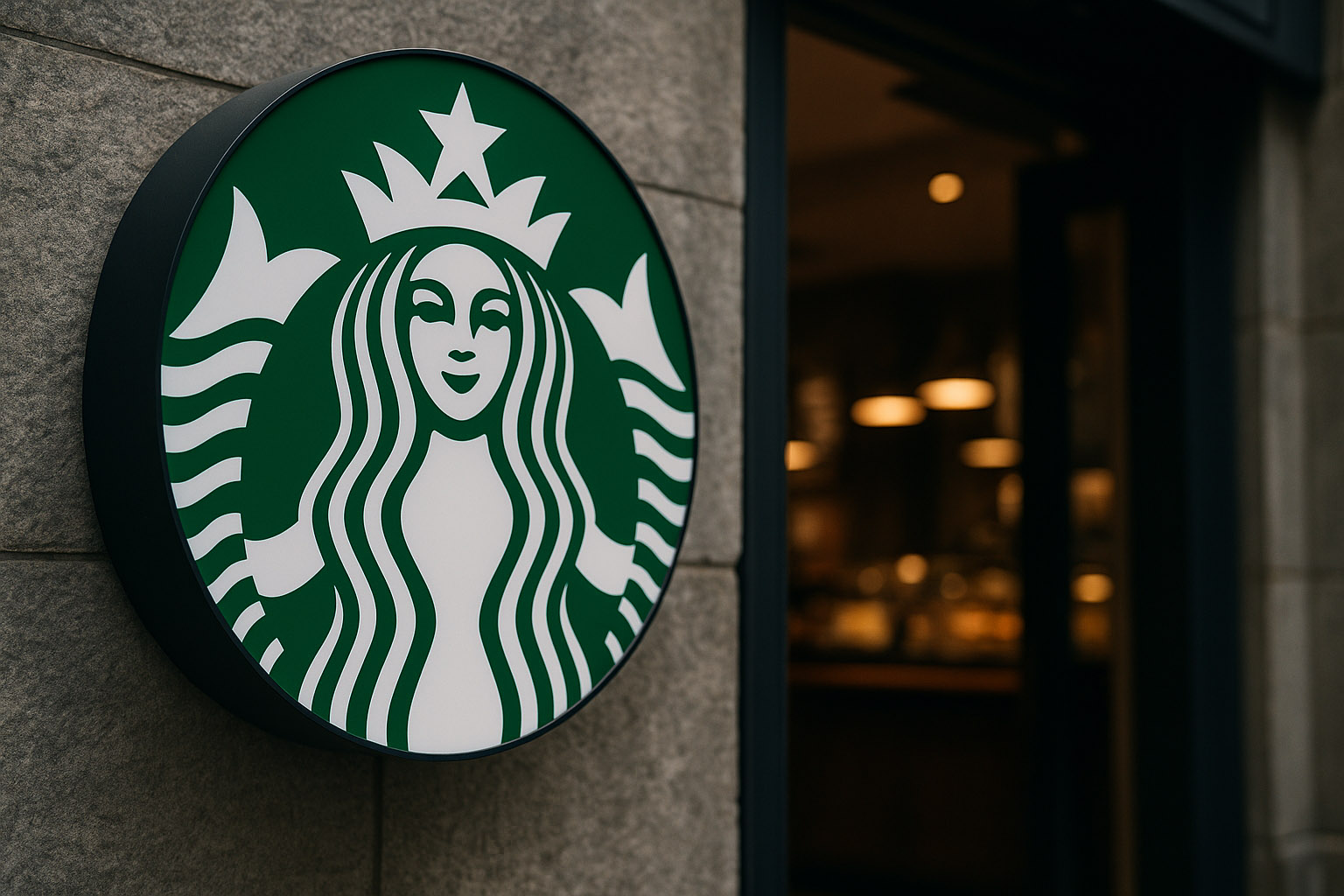
Starbucks
- Designed by: Terry Heckler (1971), Lippincott (2011 refresh)
- Style: Nordic mythology meets minimal modernism
- Unknown fact: The siren’s hair hides two tails, a reference to maritime folklore.
The 2011 redesign removed text entirely — a bold move proving the brand’s global recognition power.
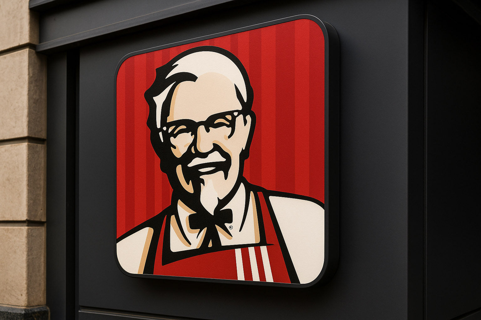
KFC
- Designed by: Lippincott & Margulies (1952 original), Landor (2006), Wieden+Kennedy (2018)
- Cost: Unknown, but full campaign exceeded $20 million
- Style: Portrait logo, script typography, Americana nostalgia
- Unknown fact: Colonel Sanders’ bowtie was added later to suggest a body under his head silhouette.
The red-and-white palette is designed to evoke familiarity and trust in mass markets.
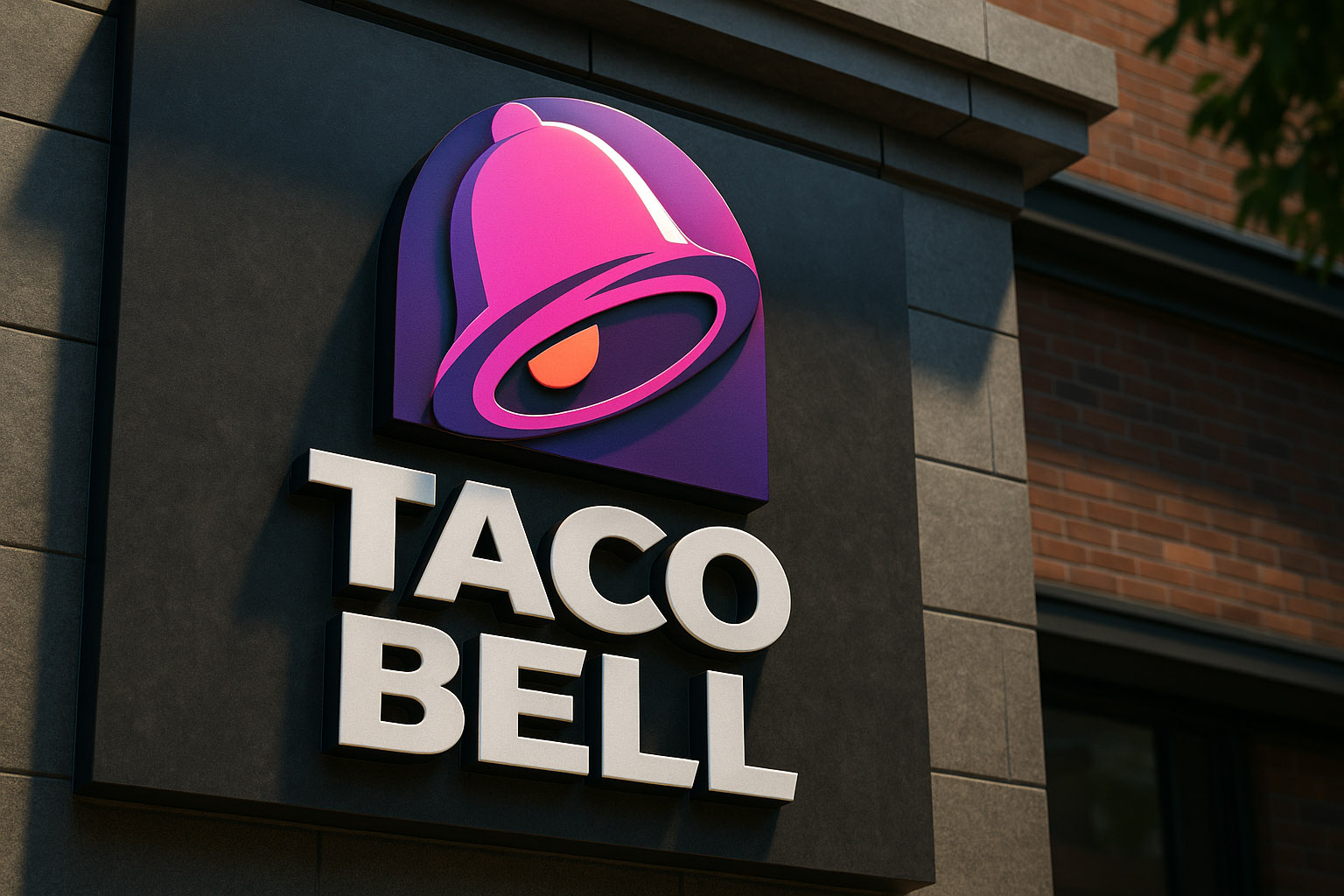
Taco Bell
- Designed by: Lippincott (1995), updated by TBD (2016)
- Cost: $20 million rollout
- Style: Abstract bell form, purple gradient
- Unknown fact: The bell is tilted to match the curve of the “B”, balancing motion and identity.
Its redesign exemplifies how minimalist design keeps pace with digital use.
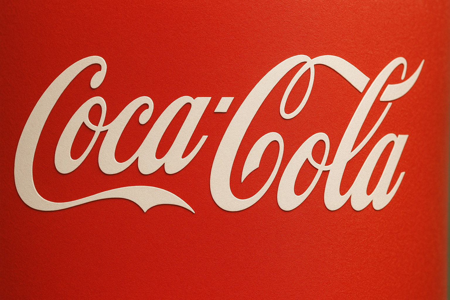
Coca-Cola
- Designed by: Frank Mason Robinson (1886)
- Style: Spencerian script
- Unknown fact: The logo has never been officially redesigned, only adjusted — a testament to timeless identity.
Coca-Cola’s script remains an enduring example of personality through lettering.
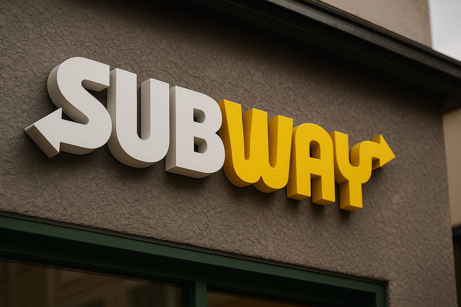
Subway
- Designed by: Minale Tattersfield (1968), refreshed by Turner Duckworth (2016)
- Style: Arrows represent entry/exit motion of a subway line
- Unknown fact: Subway’s 2016 rebrand emphasized customization and flow, aligning visual direction with service behavior.
Clean geometry and bold colors keep it fresh for digital and in-store formats alike.
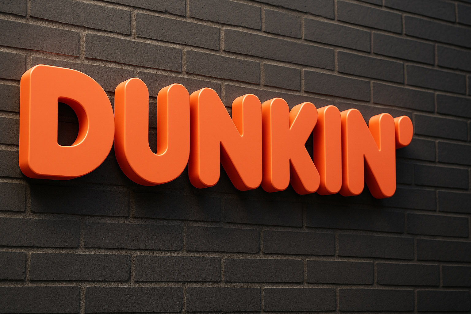
- Designed by: Jones Knowles Ritchie (2018 rebrand)
- Style: Playful geometric typography, brand simplification
- Unknown fact: The apostrophe in Dunkin’ subtly points upward, symbolizing positive energy.
By dropping “Donuts,” the brand positioned itself beyond baked goods — toward coffee culture.
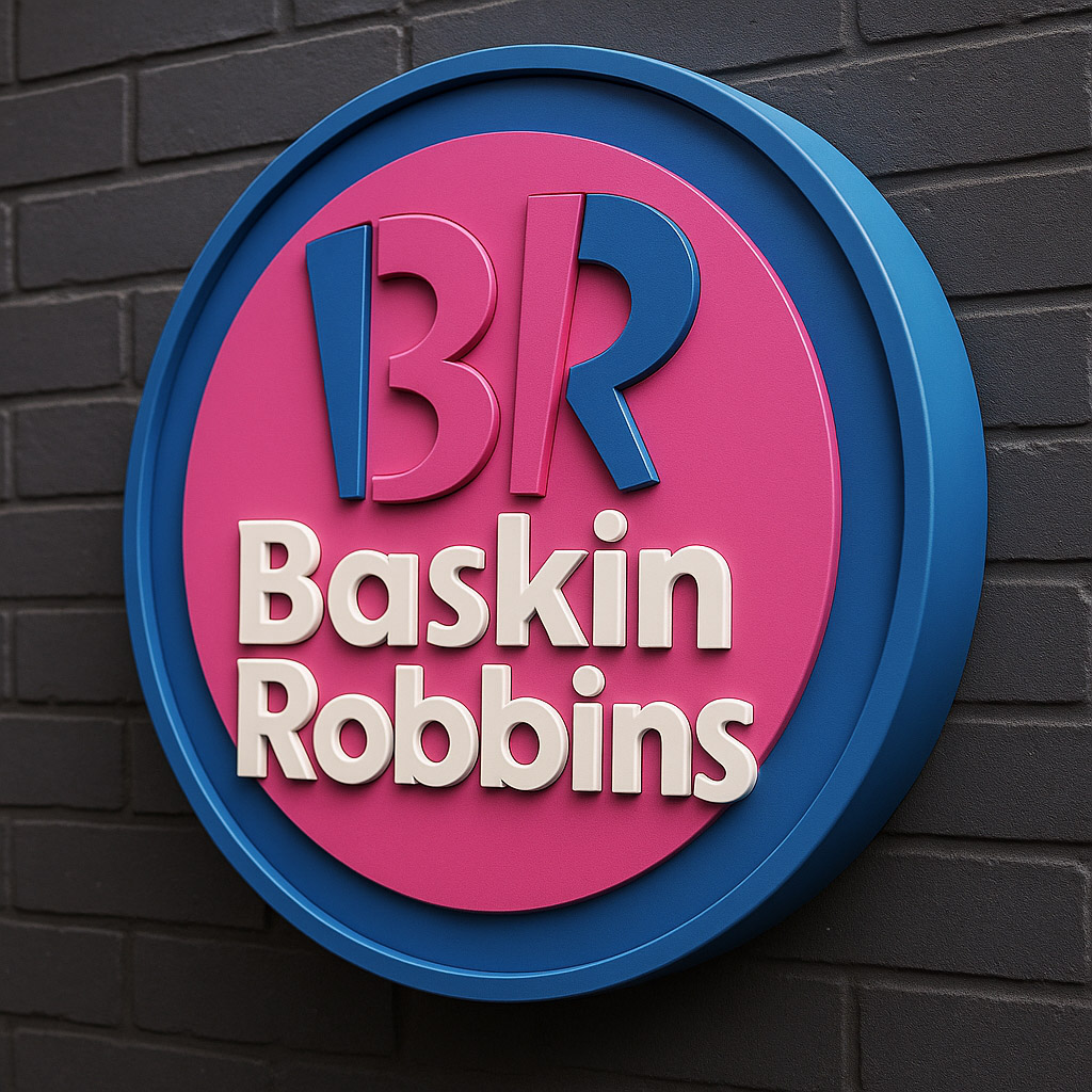
Baskin-Robbins
- Designed by: Ogilvy & Mather (1953), refreshed by Sterling Brands (2006, 2022)
- Style: Hidden “31” in the logotype, dual-tone palette
- Unknown fact: The “31” represents the idea of choice — a flavor for every day of the month.
The updated logo returned to its 1970s roots, proving the power of nostalgia-driven redesigns.
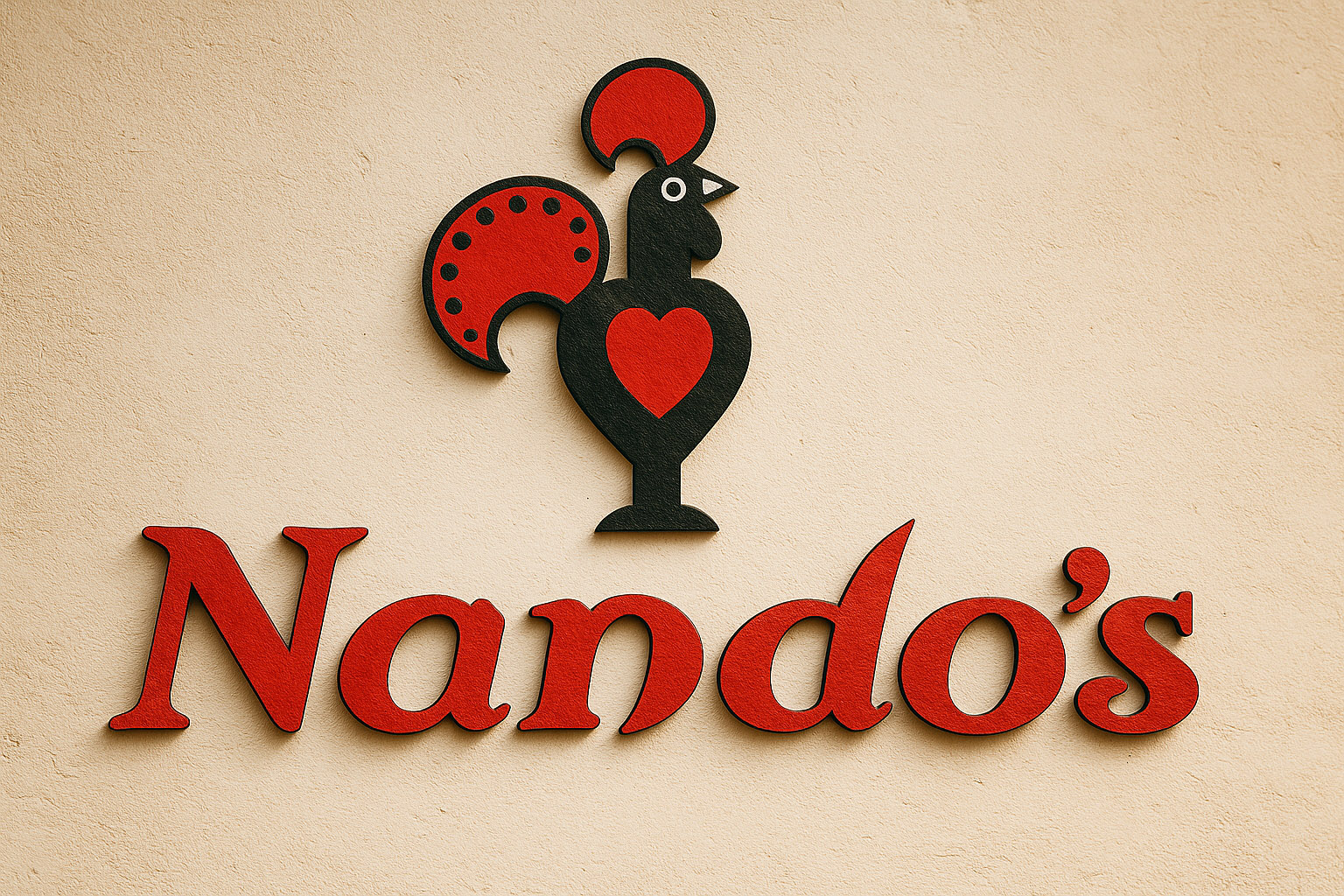
Nando’s
- Designed by: The Jupiter Drawing Room (1994), Red&Yellow (2017 refresh)
- Style: Afro-Portuguese hand-drawn style, warm palette, heritage typography
- Unknown fact: The Barcelos cockerel (Portuguese folklore symbol) became Nando’s emotional link to origin and authenticity.
Hand-rendered design choices intentionally preserve the brand’s cultural character.
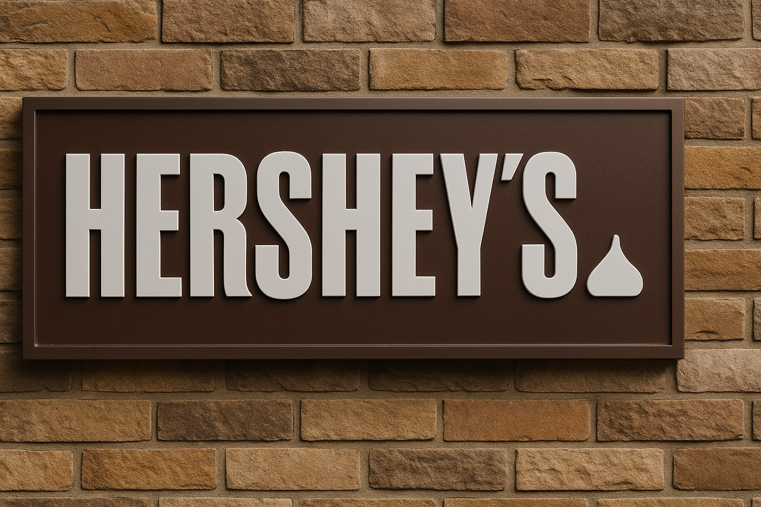
Hershey’s
- Designed by: Hershey Global Design (2014)
- Style: Minimal wordmark + chocolate bar icon
- Unknown fact: The small “kiss” shape next to the logo mirrors the product silhouette — a subtle yet strategic simplification.
Despite early mockery for its “poop emoji” similarity, the logo remains consistent with the brand’s digital ambitions.
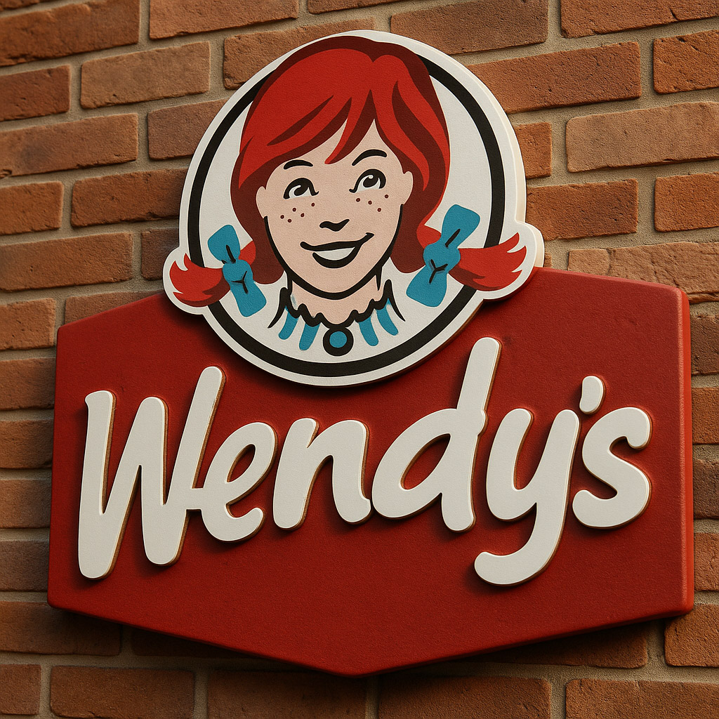
Wendy’s
- Designed by: Tesser Inc. (2012 redesign)
- Style: Hand-drawn script, portrait mark, Americana nostalgia
- Unknown fact: The “Mom” word hidden in Wendy’s collar was unintentional, according to designers — though it became an internet myth.
The redesign balanced heritage and modernization without losing warmth.
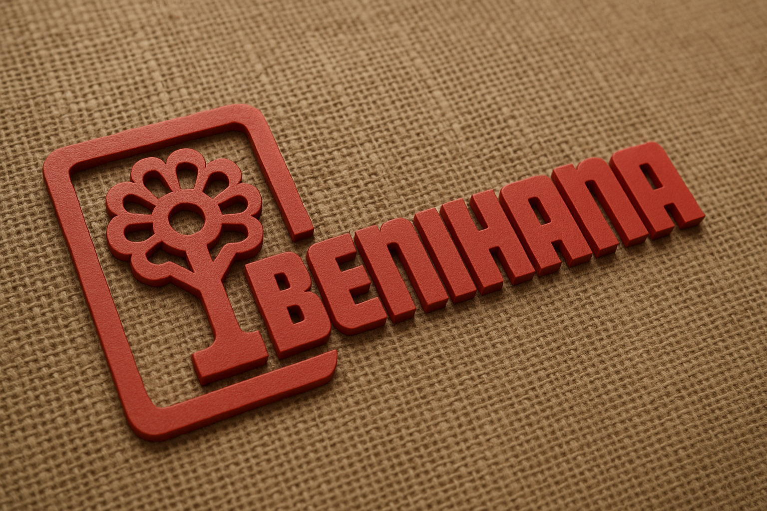
Benihana
- Designed by: Paula Scher (Pentagram, 2004 refresh)
- Style: Japanese-inspired geometric typography
- Unknown fact: The mark’s simplicity reflects architectural influence from traditional Japanese sign systems.
It demonstrates how Western brands adapt cultural semiotics respectfully through design.
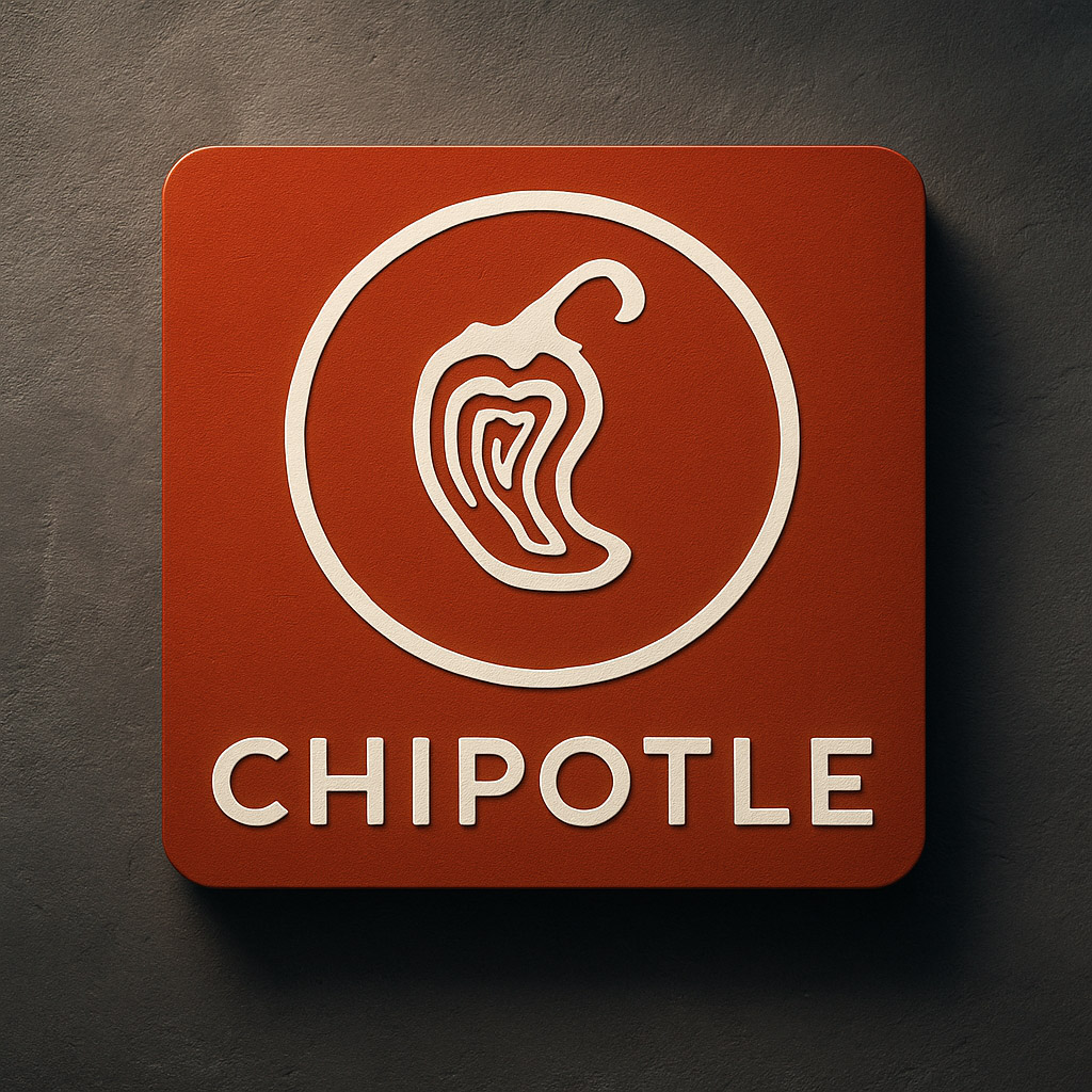
Chipotle
- Designed by: Sequence San Francisco (2009 rebrand)
- Cost: $2–3 million (estimated)
- Style: Rustic minimalism — hand-drawn pepper symbol
- Unknown fact: The logo is one of the few that remains flat yet organic, embracing natural imperfections to echo sustainability.
Its restrained aesthetic set a trend for modern, farm-to-table branding visuals.
Style Notes: The Appetite of Design
Food and beverage logos are a study in emotional contrast — between hunger and trust, playfulness and tradition.
Designers balance warmth, color psychology, and geometric clarity to ensure recognizability even at small sizes.
Common traits in this category:
- Red and yellow dominate, evoking warmth and appetite.
- Circular and rounded shapes suggest inclusivity and friendliness.
- Handmade elements communicate authenticity.
- Minimalist updates keep brands fresh while preserving their story.
Unknown Insights
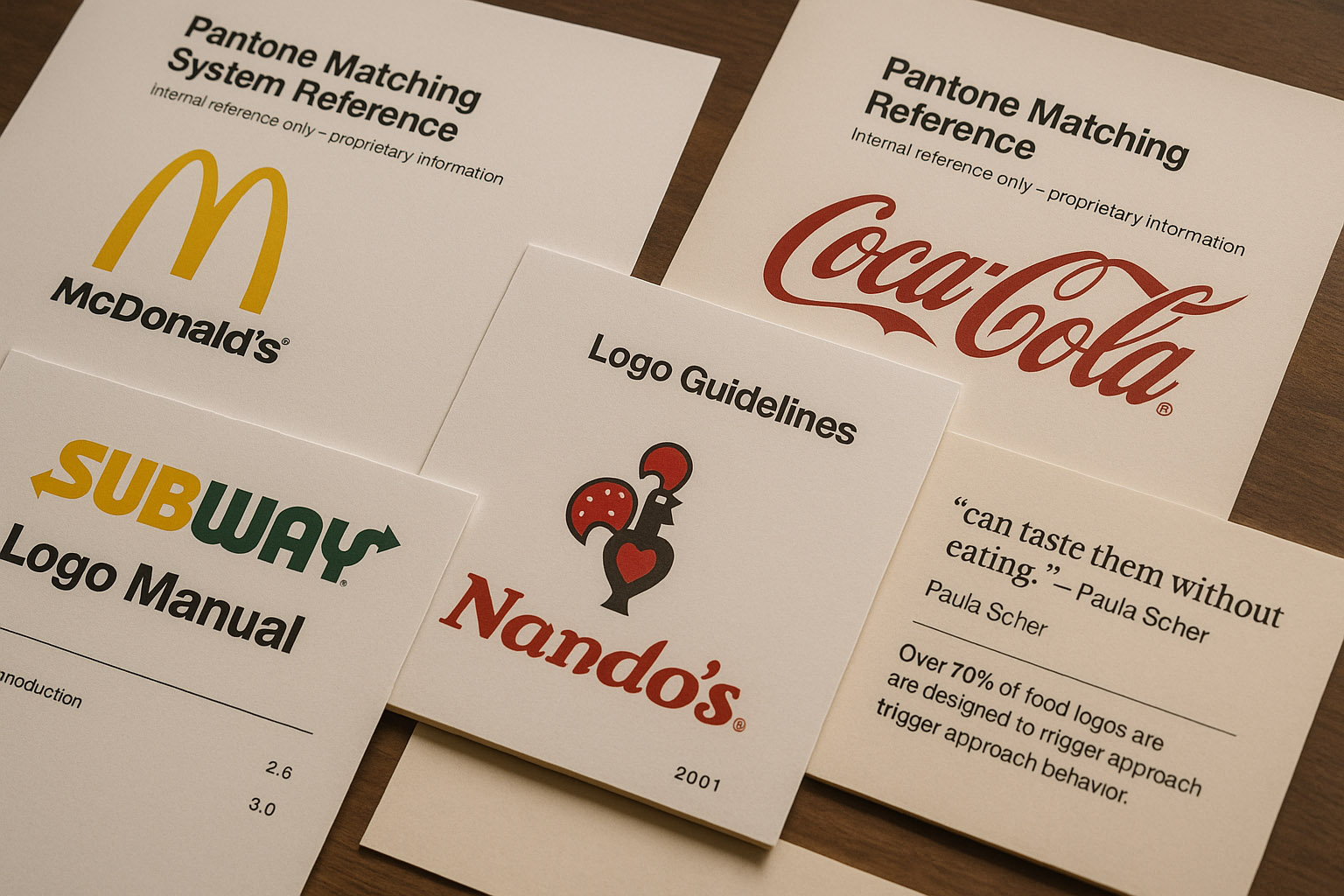
- McDonald’s and Coca-Cola share internal Pantone references that are proprietary — not publicly listed.
- Some brands, like Subway and Nando’s, maintain in-house logo manuals dating back decades, revised only internally.
- According to Logo Modernism, over *70% of food logos are designed to trigger approach behavior — a subconscious cue of trust and safety.
- Paula Scher once noted that food brands succeed visually when “you can taste them without eating them.”
Conclusion
The world’s best meal company logos do more than sell products — they symbolize comfort, memory, and cultural ritual.
Whether it’s the bold arches of McDonald’s or the humble pepper of Chipotle, these marks remind us that the simplest forms often carry the deepest meaning.
“Designing food logos isn’t just about appetite — it’s about belonging.”