The Art of the Album Cover: Iconic CD Designs & the Creators Behind Them
How CD cover design shaped the visual identity of music, from surreal artwork to bold branding.

How CD cover design shaped the visual identity of music, from surreal artwork to bold branding.
From minimal grids to surreal collages, CD cover design once defined how music looked, not just how it sounded.
Before streaming thumbnails and AI playlists, there was the album cover—a 12cm x 12cm square of graphic design magic. In the CD era, these covers were more than packaging: they were part of the listening experience, influencing how we felt about the music itself.
This article explores some of the most iconic CD cover designs, spotlighting the artists and studios behind them, and tracing how visual design and music culture have evolved together.
Known for minimalist layouts and conceptual elegance. His cover for Unknown Pleasures (1980, also used on CD) became a visual anthem of post-punk design.

Photographer and art director whose monochromatic, raw portraits gave bands like U2 an iconic visual identity.

Dreamy, layered surrealism defined 4AD releases in the ’90s. Oliver’s work was tactile, emotional, and never literal.

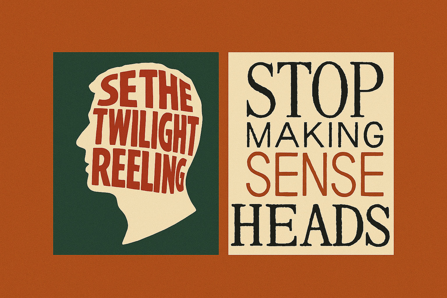
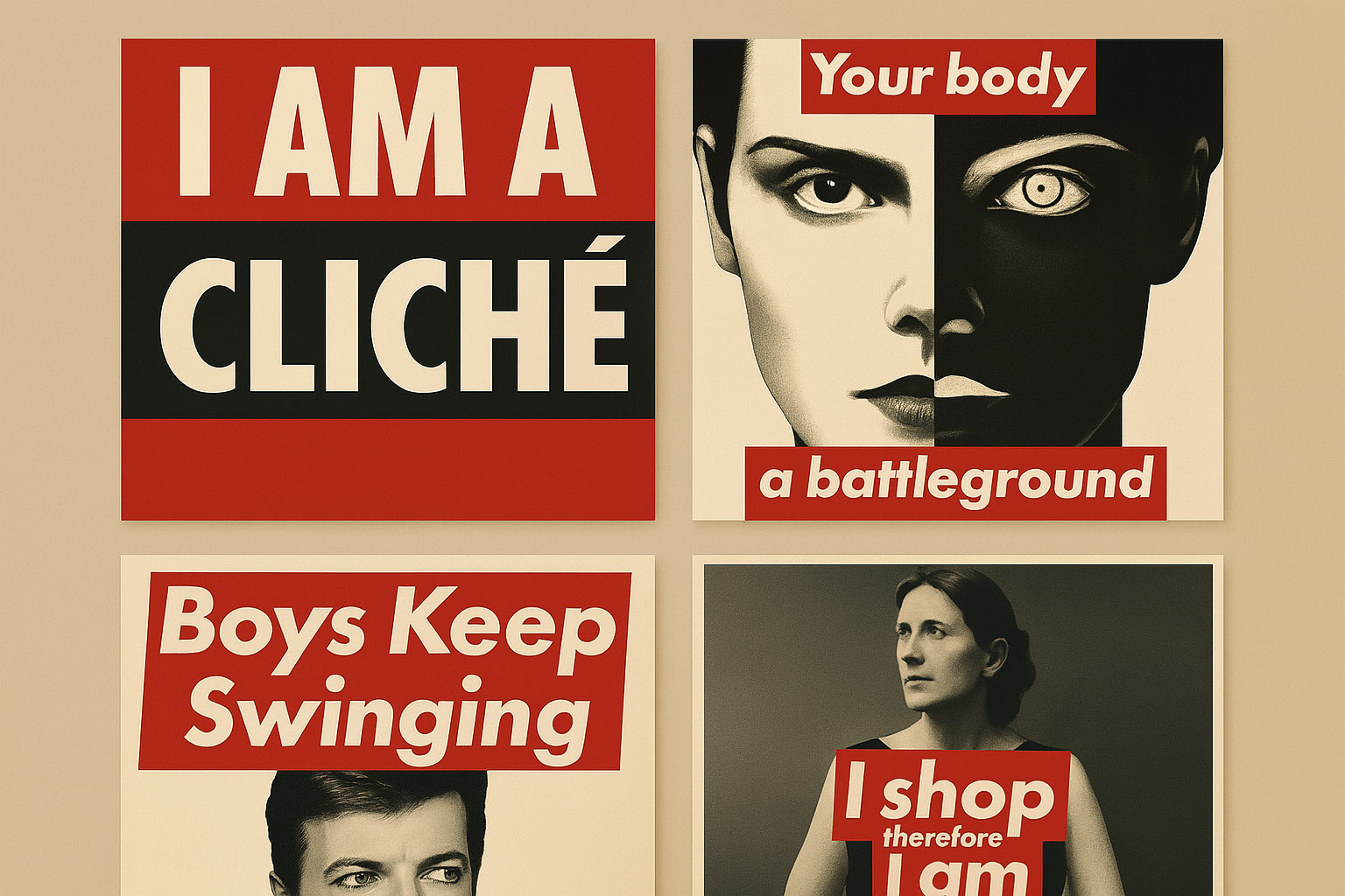
Pushed boundaries of type and concept. Known for provocative, layered visuals that elevated the role of graphic design in music packaging.
Though best known for vinyl, his surreal visual language lived on in CD-era covers—especially with Muse and other late ’90s/early 2000s alt-rock.

Known for her expressive typography and bold layouts, Scher brought a strong graphic sensibility to album packaging through her work at CBS Records and later Pentagram.
While not a dedicated album designer, her conceptual, text-based style influenced covers for artists embracing feminist and critical theory themes, such as Le Tigre and others.
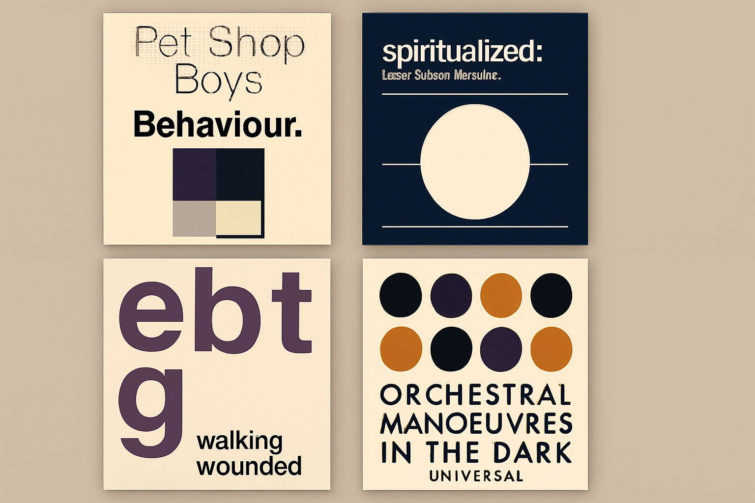
A master of minimalism and conceptual clarity, Farrow’s work merged fine art sensibility with pop presentation, particularly notable for the Pet Shop Boys’ sleek identity.
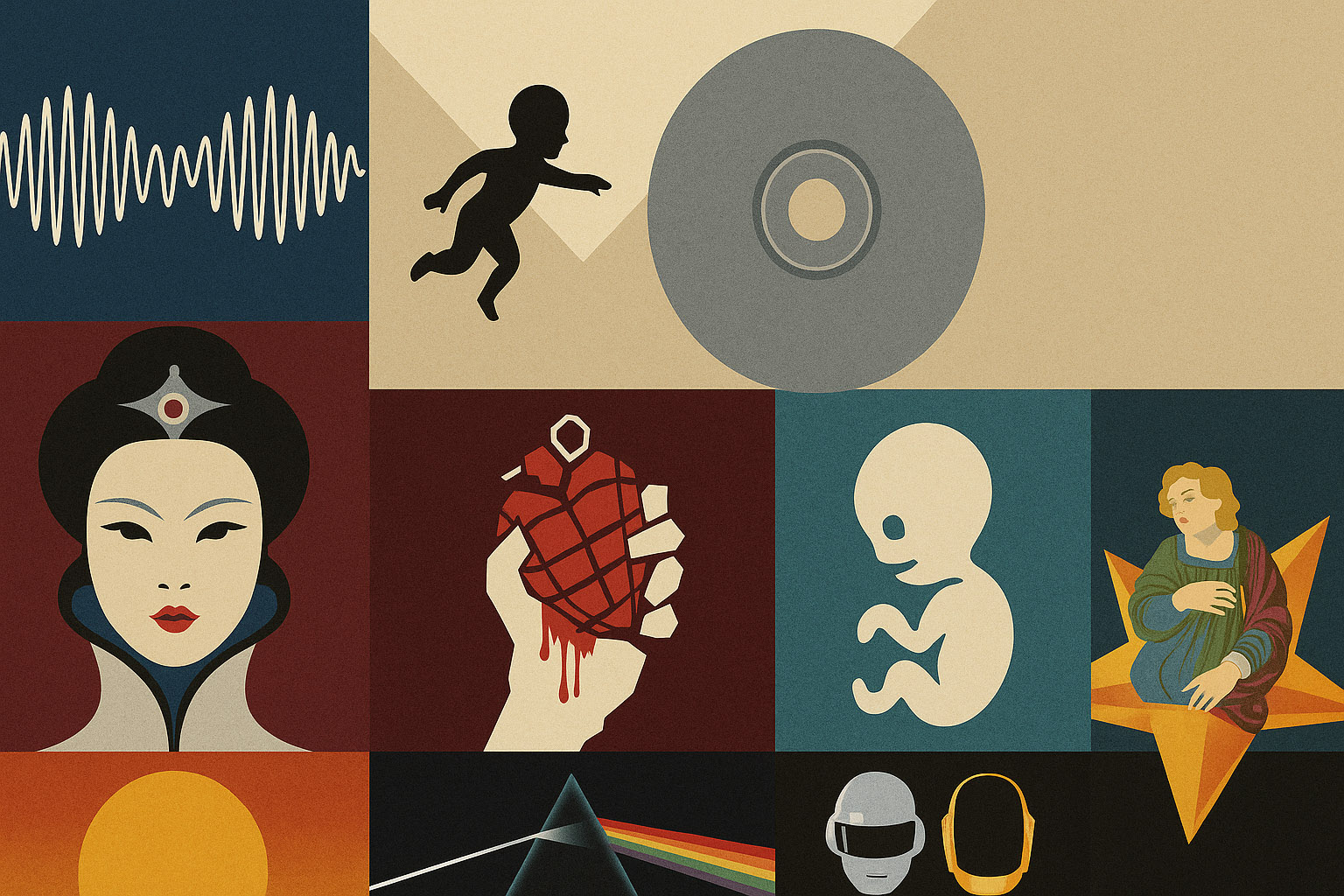
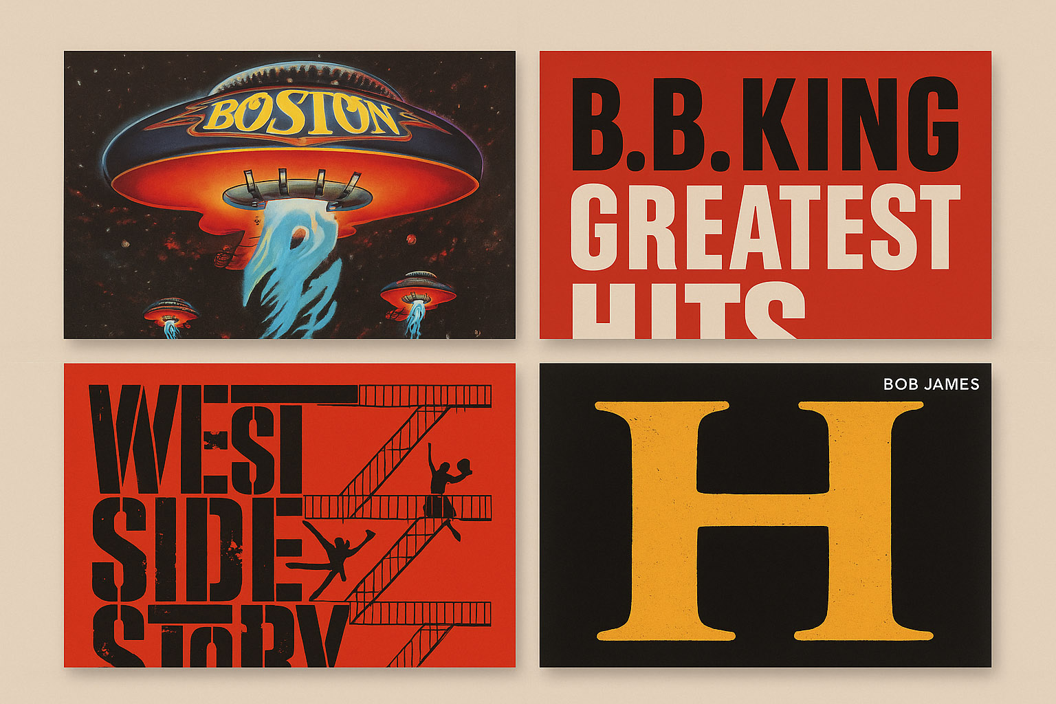
| Album & Artist | Designer | Why It’s Iconic |
|---|---|---|
| OK Computer – Radiohead | Stanley Donwood | Cryptic illustrations, digital unease |
| Nevermind – Nirvana | Robert Fisher | Cultural snapshot, raw & bold |
| Homogenic – Björk | M/M Paris | Futuristic fashion-art hybrid |
| Is This It – The Strokes | Colin Lane | Rejected US cover made it infamous |
| Mellon Collie… – Smashing Pumpkins | Frank Olinsky | Turn-of-century nostalgia fantasy |
| Ágætis byrjun – Sigur Rós | Gotti Bernhöft | Hand-drawn fragility & Icelandic mystique |
| Discovery – Daft Punk | Cedric Hervet | Neon chrome optimism of the 2000s |
| American Idiot – Green Day | Chris Bilheimer | Punchy symbol of rebellion |
| Life After Death – Notorious B.I.G. | Cey Adams | Bold typography and gothic drama |
| Parachutes – Coldplay | Blue Source | Subtle design that hinted at warmth |
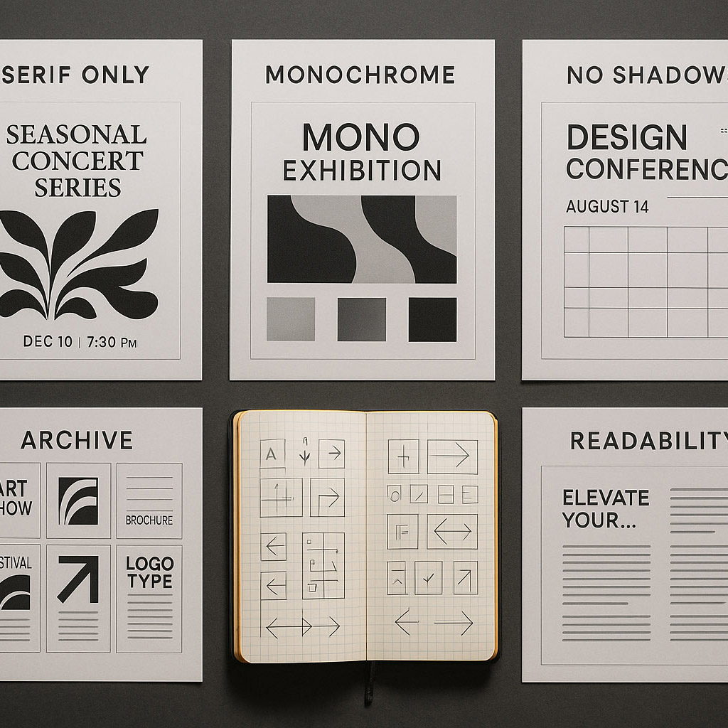
In the early days of CDs, cover designs often mimicked their vinyl predecessors—photographic portraits, band logos, and clean typesetting. But as digital tools improved in the 1990s, so did the complexity and creativity of CD art.
Designers began experimenting with:
By the 2000s, packaging incorporated more multimedia and even web-connected experiences, such as hidden URLs and CD-ROM extras. Over time, the transition to digital-first consumption meant designers needed to consider how covers looked at thumbnail scale on screens.
Different music genres developed distinct visual codes in the CD era:
| Genre | Design Characteristics |
|---|---|
| Pop & R&B | Clean photography, glossy finishes, artist-focused covers |
| Rock & Alternative | Conceptual, sometimes gritty or surreal visuals |
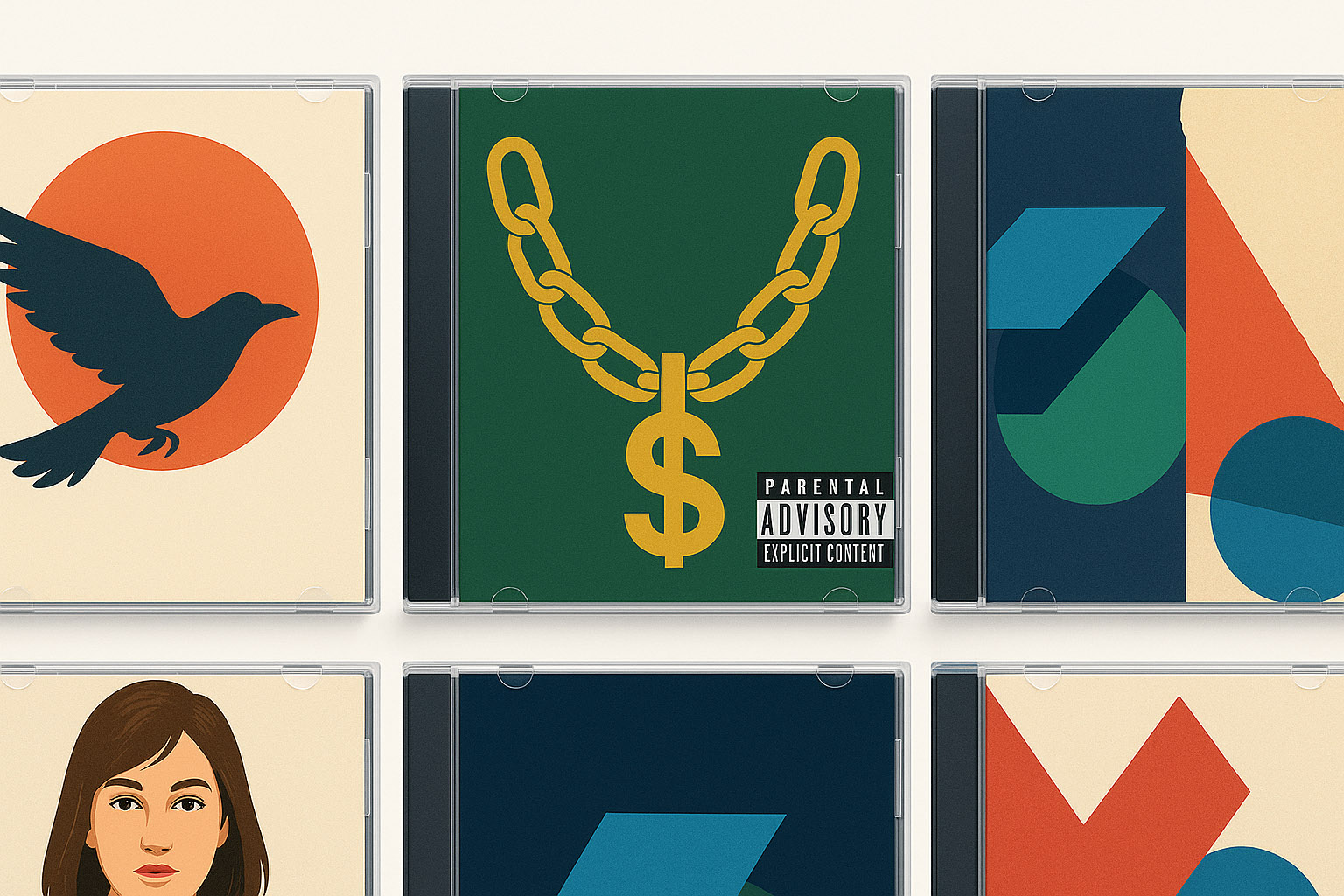
| Hip-Hop | Strong branding, bold type, symbolic icons (chains, money, parental advisory) |
| Electronic | Abstract graphics, vector shapes, and futuristic themes |
| Indie/Experimental | DIY aesthetics, hand-drawn elements, collage, unconventional materials |
These design choices weren’t just decoration—they communicated a genre’s identity before a listener pressed play.
CD covers weren’t just visuals—they were packaging stories:
Even in a small format, great CD covers turned music into a multi-sensory experience.
News, insights, case studies, and more from the rausr team — straight to your inbox.
Send us your brief, your wildest idea, or just a hello. We’ll season it with curiosity and serve back something fresh, cooked with care.